preview
cross-posted from: lemmy.world/post/43109271
Another picture from my trip in Yerevan, this is a part of the Cascades monument
cross-posted from: lemmy.world/post/43109271
Another picture from my trip in Yerevan, this is a part of the Cascades monument
preview
preview
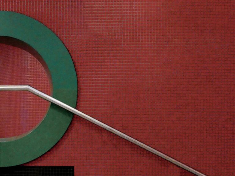
simply green and abstract, by Horst Fischer
simply green and abstract, by Horst Fischer
preview
Clockwise from top left:
- Cabbage tree
- My washing basket
- A black carousell holding white cardboard slides
- My kitchen floor
- Center: the prism mounted on a 135mm lens on an APSC camera a friend lent to me.
These are basically straight out of the camera, with minor adjustments in RawTherapee and combined into one image with InkScape.
Clockwise from top left:
- Cabbage tree
- My washing basket
- A black carousell holding white cardboard slides
- My kitchen floor
- Center: the prism mounted on a 135mm lens on an APSC camera a friend lent to me.
These are basically straight out of the camera, with minor adjustments in RawTherapee and combined into one image with InkScape.
preview
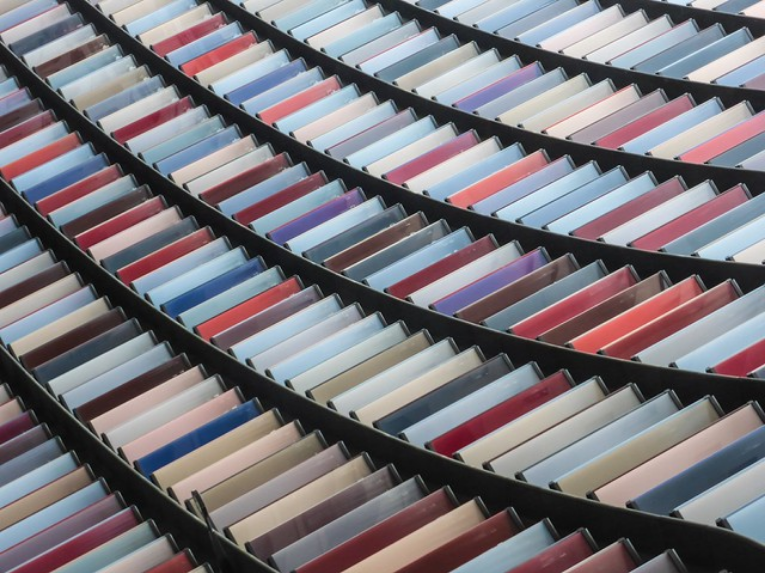
Steel Zeppelin, by John Friedman
Steel Zeppelin, by John Friedman
preview
nicht ganz gerade - not quiet straight, by VioLum (very busy)
Seen in Hamburg
nicht ganz gerade - not quiet straight, by VioLum (very busy)
Seen in Hamburg
preview
EARLY RETIREMENT, by Irene
EARLY RETIREMENT, by Irene
preview
Antique Rainbow, by John Friedman
Antique Rainbow, by John Friedman
preview
Minimal stripes, by Mario Županović
Minimal stripes, by Mario Županović
preview
Fall Lake, by Evelyn Berg
spoiler
>car body detail
Fall Lake, by Evelyn Berg
spoiler
>car body detail
preview
Traces of amaryllis by Leo Roos
Traces of amaryllis by Leo Roos
preview
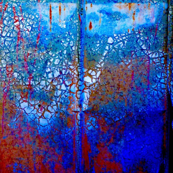
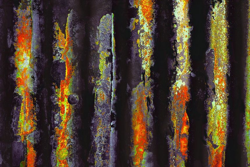
an ode to rust 'n crust and the tooth of time - HTT! by lunaryuna
Detail of an amazingly beautiful decay scenario on a epdestrian iron bridge in Wales in the outskirts of Port Talbot. I thought that rust and nature had done an impressive job to create some involuntarily art work :)
an ode to rust 'n crust and the tooth of time - HTT! by lunaryuna
Detail of an amazingly beautiful decay scenario on a epdestrian iron bridge in Wales in the outskirts of Port Talbot. I thought that rust and nature had done an impressive job to create some involuntarily art work :)
preview
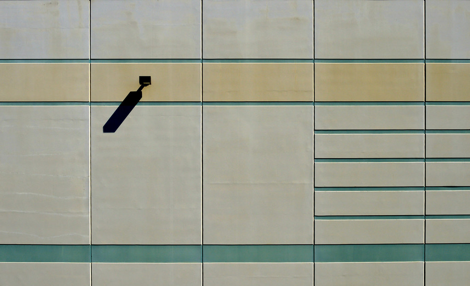
This is where the shadows come to play, by Oliver
This is where the shadows come to play, by Oliver
preview
Trying out blue Eye Shadow by Evelyn Berg
Trying out blue Eye Shadow by Evelyn Berg
preview
Incidental Picasso by Evelyn Berg
Incidental Picasso by Evelyn Berg
preview
shoppen auf linie | berlin | 2405, by feliksbln
Fassadendetail der East Side Mall, Berlin
Architekt: Ben van Berkel, 2016-18
Facades detail of the East Side Mall, Berlin
architect: Ben van Berkel, 2016-18 (translation via Firefox)
shoppen auf linie | berlin | 2405, by feliksbln
Fassadendetail der East Side Mall, Berlin
Architekt: Ben van Berkel, 2016-18
Facades detail of the East Side Mall, Berlin
architect: Ben van Berkel, 2016-18 (translation via Firefox)
preview
metallic reflections, by Bluesrose
metallic reflections, by Bluesrose
preview
Tunneling III, by Carl Vanassche
Tunneling III, by Carl Vanassche
preview
Dots and Stripes, by Evelyn Berg
Dots and Stripes, by Evelyn Berg
preview
preview
preview
playing with decay …by José Eduardo Silva
spoiler
>window from Kochi, Kerala, India
playing with decay …by José Eduardo Silva
spoiler
>window from Kochi, Kerala, India
preview
Il Rubikone, by adriano dg
Il Rubikone, by adriano dg
preview
preview
Nuage perlé, by Bertrand Kulik
Pearl cloud [translation via Firefox]
Nuage perlé, by Bertrand Kulik
Pearl cloud [translation via Firefox]
preview
What’s in a Word? by Doris Burfind
What’s in a Word? by Doris Burfind
preview
fehrbelliner foh!rmen | berlin | 2408, by feliksbln
Detail eines Abganges im U-Bahnhof Fehrbelliner Platz (U3/U7), Berlin
Architekt: Rainer G. Rümmler, 1967-71
Detail of a departure in the Fehrbelliner Platz underground station [translation via firefox]
fehrbelliner foh!rmen | berlin | 2408, by feliksbln
Detail eines Abganges im U-Bahnhof Fehrbelliner Platz (U3/U7), Berlin
Architekt: Rainer G. Rümmler, 1967-71
Detail of a departure in the Fehrbelliner Platz underground station [translation via firefox]
preview
Keys To The Kingdom, by Doug
Abstract architecture, central London.
Keys To The Kingdom, by Doug
Abstract architecture, central London.
preview
DSC_0283, by stuart allen
DSC_0283, by stuart allen
preview
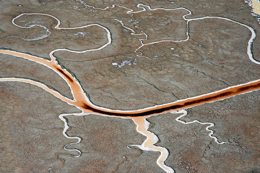
Colorful channels, San Francisco Bay mud, by Michael Rymer
Aerial photograph of colorful channels in former salt-evaporation ponds, San Francisco Bay mud, Menlo Park, San Mateo County, California. This site is immediately west of Facebook and the image area is about the same size as the Facebook campus.
Colorful channels, San Francisco Bay mud, by Michael Rymer
Aerial photograph of colorful channels in former salt-evaporation ponds, San Francisco Bay mud, Menlo Park, San Mateo County, California. This site is immediately west of Facebook and the image area is about the same size as the Facebook campus.
preview
Goodbye Mr Hayward, by Croydon girl
Goodbye Mr Hayward, by Croydon girl
preview
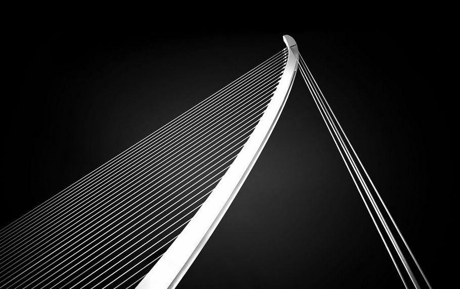
Valencia Bridge, by David Kutschke
Valencia Bridge, by David Kutschke
preview
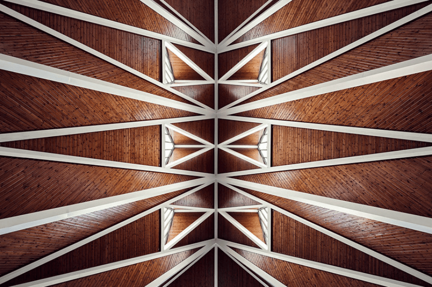
Perplexity, by Otto Berkeley
Hidden away at Lorrimore Square in South London is St Paul’s Church, which I came across during September’s Open House weekend. The church is a small but remarkable Grade II-listed building built in the late 1950s after the original church burned down during the second world war. Replacing the original 19th-century Victorian Gothic style is an innovative post-war design by John Wimbleton of architect practice Woodroffe, Buchanan & Coulter, built from a mixture of brick, copper and rubble stone from the old church.
I was drawn to the elegance of the triangular motif around the church and the way it represents the importance of the Trinity in Eucharistic worship, but there was also something remarkable about the balance the architecture struck inside the building: an abstract and almost minimalist quality to its structure, and at the same time an atmosphere within the church – situated on the first floor above a day centre – that was warm, welcoming and full of character. The Open House staff volunteering at the church were incredibly gracious about allowing me to photograph the interior from every angle, but I kept coming back to this look-up of the church’s beautifully geometric roof, which seemed to convey the airy simplicity of the building’s structure as well as its progressive design.
The image was straightforward to shoot – with the camera resting on the ground, the settings dialled in and the exposures triggered using a shutter remote – and equally straightforward to edit. Seven exposures were blended in Photoshop using luminosity masking, balancing darker exposures for the light streaming through the windows and brighter exposures to bring out the rich detail within the roof’s steep timber. Once the exposures were blended, I used the Pen Tool to create a selection of the concrete frame, desaturating its warmer tones and then using my brighter exposures at a low opacity with the blend modes set to Soft Light and Screen. This helped to reinforce the bold framework within the image and created a nice contrast against the darker and more detailed texture in the timber.
Colour-grading the image was a mixture of Curves and Levels adjustments, with Colour Balance and Selective Colour adjustments to find the right combination of yellow, red and magenta. It was important to me to bring out the warm tones within the roof, but I was also wary of the image becoming an overload of red and orange, and used a Gradient Map to add a hint of dark blue in the shadows to offset this. The final result was a quick and easy image to capture and edit, but it was also one of the most rewarding to visit, with the aspiration and thoughtfulness of the building’s design leaving a lasting impression.
You can also connect with me on Facebook, 500px, Google+ and Instagram.
Perplexity, by Otto Berkeley
Hidden away at Lorrimore Square in South London is St Paul’s Church, which I came across during September’s Open House weekend. The church is a small but remarkable Grade II-listed building built in the late 1950s after the original church burned down during the second world war. Replacing the original 19th-century Victorian Gothic style is an innovative post-war design by John Wimbleton of architect practice Woodroffe, Buchanan & Coulter, built from a mixture of brick, copper and rubble stone from the old church.
I was drawn to the elegance of the triangular motif around the church and the way it represents the importance of the Trinity in Eucharistic worship, but there was also something remarkable about the balance the architecture struck inside the building: an abstract and almost minimalist quality to its structure, and at the same time an atmosphere within the church – situated on the first floor above a day centre – that was warm, welcoming and full of character. The Open House staff volunteering at the church were incredibly gracious about allowing me to photograph the interior from every angle, but I kept coming back to this look-up of the church’s beautifully geometric roof, which seemed to convey the airy simplicity of the building’s structure as well as its progressive design.
The image was straightforward to shoot – with the camera resting on the ground, the settings dialled in and the exposures triggered using a shutter remote – and equally straightforward to edit. Seven exposures were blended in Photoshop using luminosity masking, balancing darker exposures for the light streaming through the windows and brighter exposures to bring out the rich detail within the roof’s steep timber. Once the exposures were blended, I used the Pen Tool to create a selection of the concrete frame, desaturating its warmer tones and then using my brighter exposures at a low opacity with the blend modes set to Soft Light and Screen. This helped to reinforce the bold framework within the image and created a nice contrast against the darker and more detailed texture in the timber.
Colour-grading the image was a mixture of Curves and Levels adjustments, with Colour Balance and Selective Colour adjustments to find the right combination of yellow, red and magenta. It was important to me to bring out the warm tones within the roof, but I was also wary of the image becoming an overload of red and orange, and used a Gradient Map to add a hint of dark blue in the shadows to offset this. The final result was a quick and easy image to capture and edit, but it was also one of the most rewarding to visit, with the aspiration and thoughtfulness of the building’s design leaving a lasting impression.
You can also connect with me on Facebook, 500px, Google+ and Instagram.