There are a few scenarios where we might need to change the level of a heading (<h1>–<h6>). As an example, we create a component with a <h1>, but then we use the component in a different context where it needs to be a <h2>. I know, I know, that’s what component props are for, but the headingoffset HTML attribute is another option.
Another example: the heading hierarchy is wrong, but we don’t have full control over the HTML. headingoffset might be able to fix that too, depending on the HTML that we do have access to.
Firefox Nightly 153 shipped headingoffset behind the dom.headingoffset.enabled flag, so we’re a way off, and it isn’t really usable until all web browsers support it, but it’s well worth a look now.
There are a few scenarios where we might need to change the level of a heading (<h1>–<h6>). As an example, we create a component with a <h1>, but then we use the component in a different context where it needs to be a <h2>. I know, I know, that’s what component props are for, but the headingoffset HTML attribute is another option.
Another example: the heading hierarchy is wrong, but we don’t have full control over the HTML. headingoffset might be able to fix that too, depending on the HTML that we do have access to.
Firefox Nightly 153 shipped headingoffset behind the dom.headingoffset.enabled flag, so we’re a way off, and it isn’t really usable until all web browsers support it, but it’s well worth a look now.
HTML has been gobbling up swathes of what used to be JavaScript’s remit. This page lists a bunch of dynamic functionality that we can now achieve with just HTML.
HTML has been gobbling up swathes of what used to be JavaScript’s remit. This page lists a bunch of dynamic functionality that we can now achieve with just HTML.
The element is currently only available in Chrome 144+, but Mozilla and WebKit have positive positions on the new element, so it’s likely they’ll implement it as well.
The element is currently only available in Chrome 144+, but Mozilla and WebKit have positive positions on the new element, so it’s likely they’ll implement it as well.
I’m used to 1366x768 screens, and when I first started making my personal website it was based on that resolution… it wasn’t until one day I checked it on a 1920x1080 screen that I noticed how weird the design got because of vertically centered elements and so… I made some @media (min-width: 1601px) hacks to scale some stuff so the site would look more or less the same on bigger resolutions, but it was a sloppy solution…
I made another site later, and I was worried about scaling, so I started using 1920x1080 resolution at 150% zoom (I have bad eyesight and struggle to read on 1920x1080, so I’m actually at 1280x720 now, but at least it’s the same aspect ratio). For the site to scale, I started using viewport values for everything, including font sizes… but if the aspect ratio changes wildly, the site looks crappy :P
So right now I was banging my head around how to have a visually pleasing website for someone with bad eyesight like me, but still have it scale correctly on any resolution for mainstream usage (as I scale down for myself, lots of sites I visit get crumpled visual elements when they are using absolute positions, z-index, and so), and I decided to letterbox my site content and force the aspect ratio on any resolution so the site will always look the same, no matter the screen. I’m using JS to scale font-size according to the letterbox width, and all other elements will use % values… I don’t know, but so far it’s sounding like I just made the site future-proof as well (for new resolution changes). The site is scaling with window size, it sucks that you can’t zoom it with the browser (so it might be bad for people with even worse eyesight, but I do plan to put a ± button for font-size though, what’s comfortable for me to read might not be for everyone), but the normal zoom works on mobile…
What do you all think of the idea? Perhaps there was an easier solution, though?
I’m used to 1366x768 screens, and when I first started making my personal website it was based on that resolution… it wasn’t until one day I checked it on a 1920x1080 screen that I noticed how weird the design got because of vertically centered elements and so… I made some @media (min-width: 1601px) hacks to scale some stuff so the site would look more or less the same on bigger resolutions, but it was a sloppy solution…
I made another site later, and I was worried about scaling, so I started using 1920x1080 resolution at 150% zoom (I have bad eyesight and struggle to read on 1920x1080, so I’m actually at 1280x720 now, but at least it’s the same aspect ratio). For the site to scale, I started using viewport values for everything, including font sizes… but if the aspect ratio changes wildly, the site looks crappy :P
So right now I was banging my head around how to have a visually pleasing website for someone with bad eyesight like me, but still have it scale correctly on any resolution for mainstream usage (as I scale down for myself, lots of sites I visit get crumpled visual elements when they are using absolute positions, z-index, and so), and I decided to letterbox my site content and force the aspect ratio on any resolution so the site will always look the same, no matter the screen. I’m using JS to scale font-size according to the letterbox width, and all other elements will use % values… I don’t know, but so far it’s sounding like I just made the site future-proof as well (for new resolution changes). The site is scaling with window size, it sucks that you can’t zoom it with the browser (so it might be bad for people with even worse eyesight, but I do plan to put a ± button for font-size though, what’s comfortable for me to read might not be for everyone), but the normal zoom works on mobile…
One page on my website consists of a single large image (with absolute position and fixed width) and an imagemap. I just realized that if i shrink my browser window or try to view the page on any screen that’s not the same size as mine, the image and map become desynchronized.
I don’t think this would be a problem if i could make the imagemap use percentage or vw/vh units instead of pixels, but it doesn’t seem to work that way. It will accept percentages or vw/vh for one of a rectangular hotspot’s coordinates, even mixed, but apparently one coordinate has to be in pixels.
Does anyone know a way around this besides letting the image be bigger than the window it’s in and making users with smaller screens scroll horizontally?
I’m mostly concerned with compatibility with Firefox v138, but more generally compatible solutions are better.
<map name=“map”> <area shape=“rect” coords=“89,522,173,634” title=“font compryption” href=“inventions/compryption.htm”> </map>
A normal imagemap, as far as i can tell.
One page on my website consists of a single large image (with absolute position and fixed width) and an imagemap. I just realized that if i shrink my browser window or try to view the page on any screen that’s not the same size as mine, the image and map become desynchronized.
I don’t think this would be a problem if i could make the imagemap use percentage or vw/vh units instead of pixels, but it doesn’t seem to work that way. It will accept percentages or vw/vh for one of a rectangular hotspot’s coordinates, even mixed, but apparently one coordinate has to be in pixels.
Does anyone know a way around this besides letting the image be bigger than the window it’s in and making users with smaller screens scroll horizontally?
I’m mostly concerned with compatibility with Firefox v138, but more generally compatible solutions are better.
<map name=“map”> <area shape=“rect” coords=“89,522,173,634” title=“font compryption” href=“inventions/compryption.htm”> </map>
A normal imagemap, as far as i can tell.
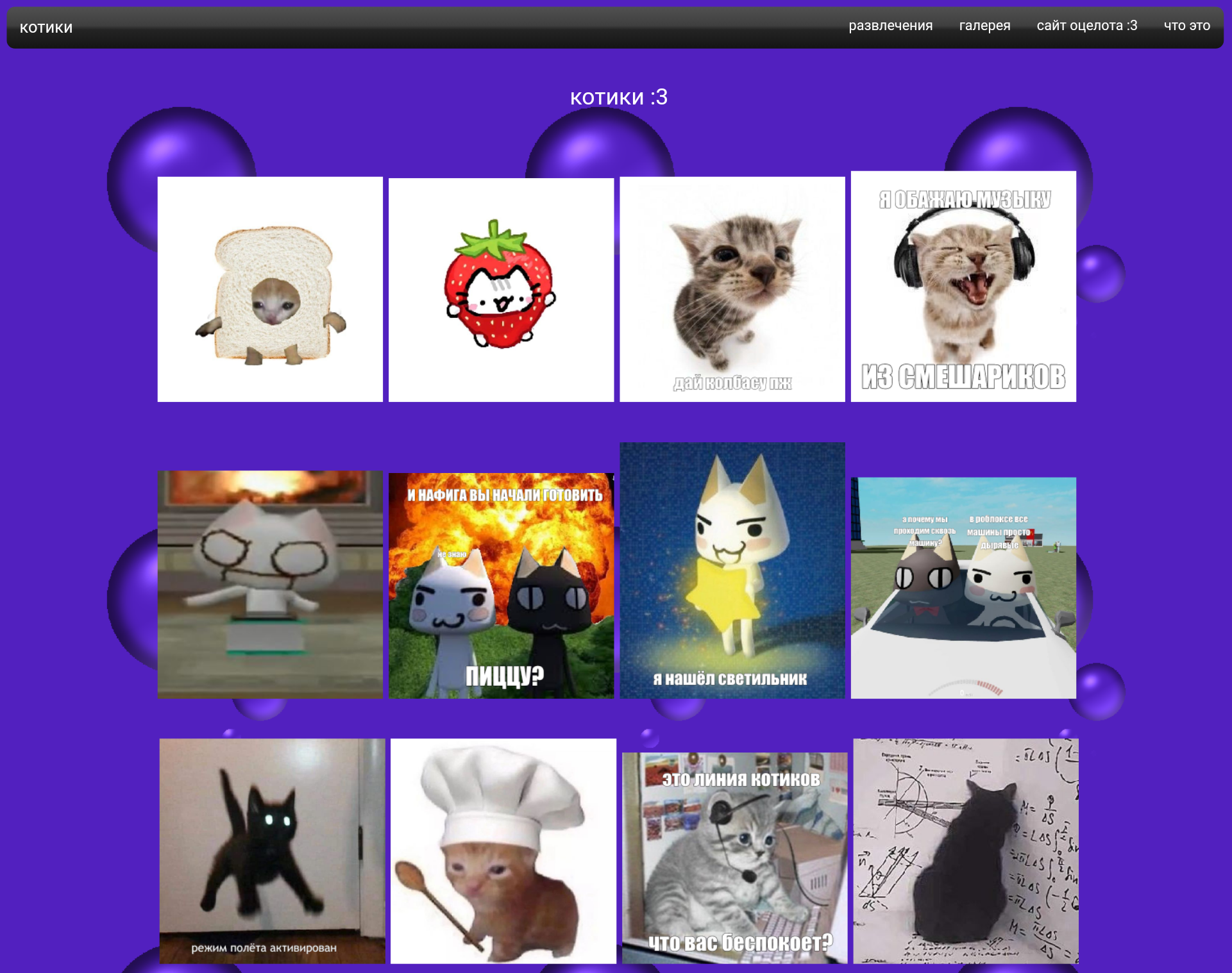
My website’s home page is meant to look like a star system, with a sun in the middle and planets (links to parts of the site) orbiting around it. That’s how it is currently (here, scroll down and right a little).
What i’m struggling with now is making moons that can orbit planets orbiting the sun. I’ve tried moving a planet’s inline CSS into a <div> element around that planet’s link and picture, and then adding another planet to that <div>, but i can’t figure out how to make it orbit around the parent planet instead of around the sun.
I did see this Codepen example, but it works differently from how the rest of my orbits are set up. It seems to rotate planets from an offset center, rather than moving them on a circular path without rotating them. And i couldn’t figure out how to adapt its moon movement to my page.
Is there a good way to do what i’m trying to do, besides rewriting my page to work like the Codepen one? Thanks in advance.
My website’s home page is meant to look like a star system, with a sun in the middle and planets (links to parts of the site) orbiting around it. That’s how it is currently (here, scroll down and right a little).
What i’m struggling with now is making moons that can orbit planets orbiting the sun. I’ve tried moving a planet’s inline CSS into a <div> element around that planet’s link and picture, and then adding another planet to that <div>, but i can’t figure out how to make it orbit around the parent planet instead of around the sun.
I did see this Codepen example, but it works differently from how the rest of my orbits are set up. It seems to rotate planets from an offset center, rather than moving them on a circular path without rotating them. And i couldn’t figure out how to adapt its moon movement to my page.
Is there a good way to do what i’m trying to do, besides rewriting my page to work like the Codepen one? Thanks in advance.
I don’t expect it to be possible, but it could be interesting to have different imagemaps for different frames of a gif or other animated image. For example, a large slowly spinning globe, that lets you click continents to go to more information about them. Is there a way to do this?
I don’t expect it to be possible, but it could be interesting to have different imagemaps for different frames of a gif or other animated image. For example, a large slowly spinning globe, that lets you click continents to go to more information about them. Is there a way to do this?
My site is currently pretty simple, but it still uses enough CSS that some parts of it look really bad in a browser like Links2 that doesn’t support CSS. Most of what i’m doing with CSS can be done with plain HTML, it just doesn’t look as good.
Is there a way to make a page try to load normally with CSS and whatnot, and then only load a simpler version with everything done in tables if the normal version can’t load? Is my best option here to make normal and simple versions of every page?
My site is currently pretty simple, but it still uses enough CSS that some parts of it look really bad in a browser like Links2 that doesn’t support CSS. Most of what i’m doing with CSS can be done with plain HTML, it just doesn’t look as good.
Is there a way to make a page try to load normally with CSS and whatnot, and then only load a simpler version with everything done in tables if the normal version can’t load? Is my best option here to make normal and simple versions of every page?
Most of the links in my website (i haven’t gotten around to all of them yet) have the size of the page they link to as a title, so you can see how big the page will be before you click the link. Is there an easy way to generate new titles for all my links based on what they link to, instead of doing it manually? Even better if it can include embedded files like images in the size preview.
I currently just edit my code in xed, my computer’s built in text editor. I haven’t looked into dedicated HTML editors yet, but i’d be open to trying one (that runs on Linux) if it can do this.
Most of the links in my website (i haven’t gotten around to all of them yet) have the size of the page they link to as a title, so you can see how big the page will be before you click the link. Is there an easy way to generate new titles for all my links based on what they link to, instead of doing it manually? Even better if it can include embedded files like images in the size preview.
I currently just edit my code in xed, my computer’s built in text editor. I haven’t looked into dedicated HTML editors yet, but i’d be open to trying one (that runs on Linux) if it can do this.
Most of the links in my website (i haven’t gotten around to all of them yet) have the size of the page they link to as a title, so you can see how big the page will be before you click the link. Is there an easy way to generate new titles for all my links based on what they link to, instead of doing it manually? Even better if it can include embedded files like images in the size preview.
I currently just edit my code in xed, my computer’s built in text editor. I haven’t looked into dedicated HTML editors yet, but i’d be open to trying one (that runs on Linux) if it can do this.
Thanks in advance.
Most of the links in my website (i haven’t gotten around to all of them yet) have the size of the page they link to as a title, so you can see how big the page will be before you click the link. Is there an easy way to generate new titles for all my links based on what they link to, instead of doing it manually? Even better if it can include embedded files like images in the size preview.
I currently just edit my code in xed, my computer’s built in text editor. I haven’t looked into dedicated HTML editors yet, but i’d be open to trying one (that runs on Linux) if it can do this.
Right now, I would like a easy editor that allows me to not worry about HTML4 syntax, and simply adjust the rendered text, while I can see the HTML source code.
The reason I need something like this is that I sometimes do make note() in G’MIC which looks like this:
#@gui:_=separator(),_=note("<center><b>- Additional Information -</b></center>")
See that inside note(“”)? That’s HTML4. And while I can do without a editor, I feel that it would be better to use an actual editor where I can copy and paste.
Right now, I would like a easy editor that allows me to not worry about HTML4 syntax, and simply adjust the rendered text, while I can see the HTML source code.
The reason I need something like this is that I sometimes do make note() in G’MIC which looks like this:
#@gui:_=separator(),_=note("<center><b>- Additional Information -</b></center>")
See that inside note(“”)? That’s HTML4. And while I can do without a editor, I feel that it would be better to use an actual editor where I can copy and paste.
Right now, I would like a easy editor that allows me to not worry about HTML4 syntax, and simply adjust the rendered text, while I can see the HTML source code.
The reason I need something like this is that I sometimes do make note() in G’MIC which looks like this:
#@gui:_=separator(),_=note("<center><b>- Additional Information -</b></center>")
See that inside note(“”)? That’s HTML4. And while I can do without a editor, I feel that it would be better to use an actual editor where I can copy and paste.
My code can look something like this (Without wrap lines):
spoiler
<b>Palette CLI Information</b>\n\n <i>Main Source of Palettes - </i><a href=\“https://lospec.com/palette-list\”> LoSpec Palette List</a>\n\nPalette Number – pal number_id = pal name_id – Full Palette Name by Author[if mentioned]\n\n1 – +pal 0 = +pal bw – Black & White\n2 – +pal 1 = +pal rgb – Red-Green-Blue\n3 – +pal 2 = +pal b_rgb – Black with Red-Green-Blue\n4 – +pal 3 = +pal bw_rgb – Black & White with Red-Green-Blue\n5 – +pal 4 = +pal cmy – Cyan-Magenta-Yellow\n6 – +pal 5 = +pal cmyk – Cyan-Magenta-Yellow-Black\n7 – +pal 6 = +pal w_cmyk – White-Cyan-Magenta-Yellow-Black\n8 – +pal 7 = +pal rgbcmy – Red-Green-Blue with Cyan-Magenta-Yellow\n9 – +pal 8 = +pal 1bitrgb – 1-Bit RGB\n10 – +pal 9 = +pal aurora – Aurora by GrafxKid\n11 – +pal 10 = +pal zenit – Zenit-241 by Zenit40\n12 – +pal 11 = +pal gbg – Game Builder Garage: Texture-Sprite Editor Palette\n13 – +pal 12 = +pal duel – Duel by Arilyn\n14 – +pal 13 = +pal hocuspocus – Hocus Pocus Palette by Apogee Software,Ltd.\n15 – +pal 14 = +pal playpal – PLAYPAL by id Tech 1 | DOOM Engine\n16 – +pal 15 = +pal srb2 – Sonic Robo Blast 2\n17 – +pal 16 = +pal uzebox – Uzebox from Uzebox console\n18 – +pal 17 = +pal kens16 – Andrew Kensler - 16 by Andrew Kensler\n19 – +pal 18 = +pal kens32 – Andrew Kensler - 32 by Andrew Kensler\n20 – +pal 19 = +pal kens54 – Andrew Kensler - 54 by Andrew Kensler\n21 – +pal 20 = +pal aap12 – AAP-Micro 12 by Adigun A. Polack\n22 – +pal 21 = +pal aap16 – AAP-16 by Adigun A. Polack\n23 – +pal 22 = +pal aap64 – AAP-64 by Adigun A. Polack
Right now, I would like a easy editor that allows me to not worry about HTML4 syntax, and simply adjust the rendered text, while I can see the HTML source code.
The reason I need something like this is that I sometimes do make note() in G’MIC which looks like this:
#@gui:_=separator(),_=note("<center><b>- Additional Information -</b></center>")
See that inside note(“”)? That’s HTML4. And while I can do without a editor, I feel that it would be better to use an actual editor where I can copy and paste.
My code can look something like this (Without wrap lines):
spoiler
<b>Palette CLI Information</b>\n\n <i>Main Source of Palettes - </i><a href=\“https://lospec.com/palette-list\”> LoSpec Palette List</a>\n\nPalette Number – pal number_id = pal name_id – Full Palette Name by Author[if mentioned]\n\n1 – +pal 0 = +pal bw – Black & White\n2 – +pal 1 = +pal rgb – Red-Green-Blue\n3 – +pal 2 = +pal b_rgb – Black with Red-Green-Blue\n4 – +pal 3 = +pal bw_rgb – Black & White with Red-Green-Blue\n5 – +pal 4 = +pal cmy – Cyan-Magenta-Yellow\n6 – +pal 5 = +pal cmyk – Cyan-Magenta-Yellow-Black\n7 – +pal 6 = +pal w_cmyk – White-Cyan-Magenta-Yellow-Black\n8 – +pal 7 = +pal rgbcmy – Red-Green-Blue with Cyan-Magenta-Yellow\n9 – +pal 8 = +pal 1bitrgb – 1-Bit RGB\n10 – +pal 9 = +pal aurora – Aurora by GrafxKid\n11 – +pal 10 = +pal zenit – Zenit-241 by Zenit40\n12 – +pal 11 = +pal gbg – Game Builder Garage: Texture-Sprite Editor Palette\n13 – +pal 12 = +pal duel – Duel by Arilyn\n14 – +pal 13 = +pal hocuspocus – Hocus Pocus Palette by Apogee Software,Ltd.\n15 – +pal 14 = +pal playpal – PLAYPAL by id Tech 1 | DOOM Engine\n16 – +pal 15 = +pal srb2 – Sonic Robo Blast 2\n17 – +pal 16 = +pal uzebox – Uzebox from Uzebox console\n18 – +pal 17 = +pal kens16 – Andrew Kensler - 16 by Andrew Kensler\n19 – +pal 18 = +pal kens32 – Andrew Kensler - 32 by Andrew Kensler\n20 – +pal 19 = +pal kens54 – Andrew Kensler - 54 by Andrew Kensler\n21 – +pal 20 = +pal aap12 – AAP-Micro 12 by Adigun A. Polack\n22 – +pal 21 = +pal aap16 – AAP-16 by Adigun A. Polack\n23 – +pal 22 = +pal aap64 – AAP-64 by Adigun A. Polack