0
Digital Seams
Making a font for the Jamaican flag alphabet — Digital Seams
digitalseams.com
posts tagged #typography


Hi !typography@lemmy.ca, I’ve flopped through a few different font managers on Linux and didn’t really like any of them. Fontbase is pretty nice but for some reason it couldn’t render a decent chunk of my library.
Enter ZFontManager. It’s got tags, collections, a good search. It’s performing well as I’m working on tagging my collection, about 4k or so. The dev is active as well.
I haven’t seen too many people discussing this font manager, I’m curious on your thoughts?
Hi !typography@lemmy.ca, I’ve flopped through a few different font managers on Linux and didn’t really like any of them. Fontbase is pretty nice but for some reason it couldn’t render a decent chunk of my library.
Enter ZFontManager. It’s got tags, collections, a good search. It’s performing well as I’m working on tagging my collection, about 4k or so. The dev is active as well.
I haven’t seen too many people discussing this font manager, I’m curious on your thoughts?

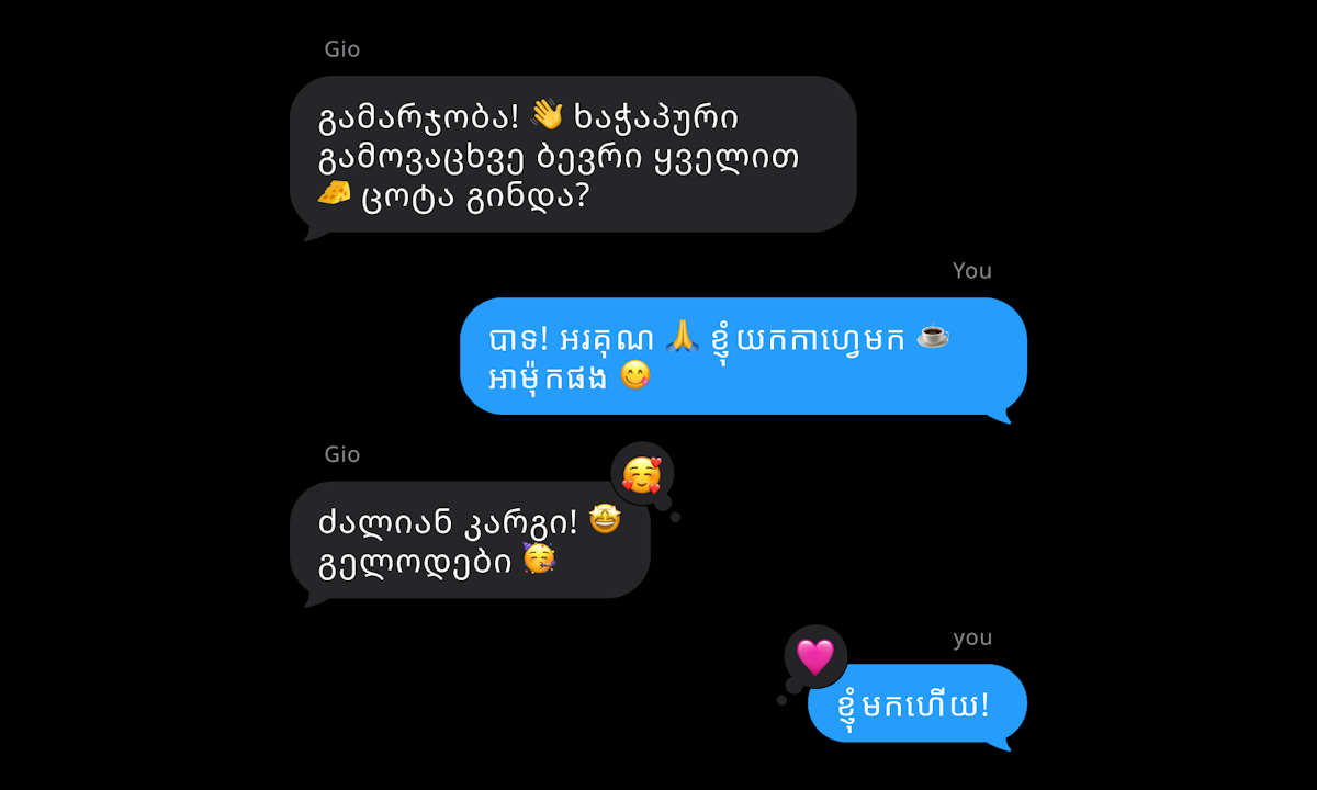
cross-posted from: sh.itjust.works/post/67892334
cross-posted from: sh.itjust.works/post/67892334

cross-posted from: lemmy.world/post/52553411
Website: www.willtirando.com.br
cross-posted from: fedia.io/m/…/4411483
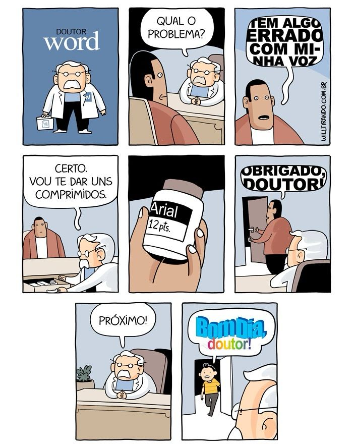
Fonts rule
Translation:
- Panel 1: Doctor Word
- Panel 2: Doctor: "What is the problem?"
- Panel 3: Patient: "There’s something wrong with my voice."
- Panel 4: Doctor: "Sure. I’ll give you some pills."
- Panel 6: Patient: "Thanks, Doctor!"
- Panel 7: Doctor: "Next!"
- Panel 8: Next patient: “Good morning, doctor!”
cross-posted from: lemmy.world/post/52553411
Website: www.willtirando.com.br
cross-posted from: fedia.io/m/…/4411483
Fonts rule
Translation:
- Panel 1: Doctor Word
- Panel 2: Doctor: "What is the problem?"
- Panel 3: Patient: "There’s something wrong with my voice."
- Panel 4: Doctor: "Sure. I’ll give you some pills."
- Panel 6: Patient: "Thanks, Doctor!"
- Panel 7: Doctor: "Next!"
- Panel 8: Next patient: “Good morning, doctor!”









Hi everyone,
I’ve been checking out the Monaspace font family lately, which seems really interesting. It has five unique styles and a solid approach to variable width and provides support for Cyrillic, Greek, and Vietnamese characters. Overall, the design is super neat and looks awesome.
However, I think I’ve found a minor bug in the form of a glitch that causes distortion and incorrect rendering.
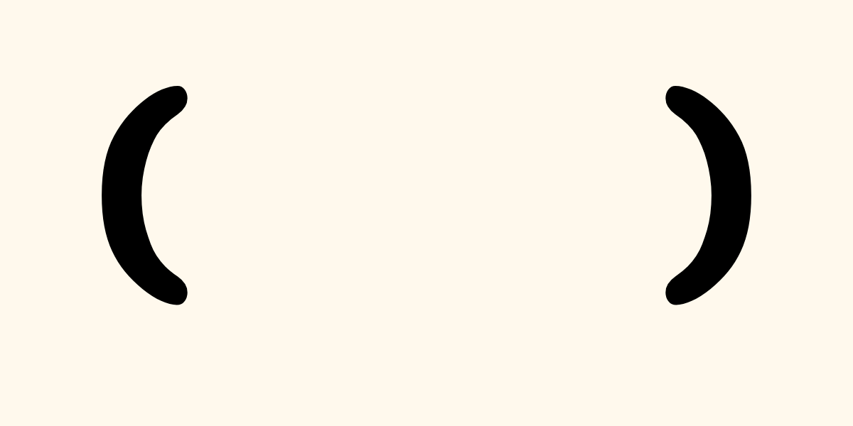
While reviewing the Argon style in FontLab, I noticed a rendering error. There appears to be an issue with the variable font regarding the following:

I tried to fix it on my end, but it was difficult without breaking the interpolation.
It would be best to inform the creators of this font about this issue so they can look into it and hopefully resolve it, improving the font for everyone.
Sorry for the inconvenience, and thanks for reading!
Hi everyone,
I’ve been checking out the Monaspace font family lately, which seems really interesting. It has five unique styles and a solid approach to variable width and provides support for Cyrillic, Greek, and Vietnamese characters. Overall, the design is super neat and looks awesome.
However, I think I’ve found a minor bug in the form of a glitch that causes distortion and incorrect rendering.
While reviewing the Argon style in FontLab, I noticed a rendering error. There appears to be an issue with the variable font regarding the following:
I tried to fix it on my end, but it was difficult without breaking the interpolation.
It would be best to inform the creators of this font about this issue so they can look into it and hopefully resolve it, improving the font for everyone.
Sorry for the inconvenience, and thanks for reading!

cross-posted from: lemmy.ml/post/48085073
cross-posted from: lemmy.ml/post/48085073
The Hells Angels aggressively protect their patches and branding, but who actually owns the font style itself?
Is it a custom typeface, an old public-domain western font they adopted, or something legally protected through association alone?
Kind of fascinating how certain lettering styles become culturally “claimed” even if nobody technically invented them.
The Hells Angels aggressively protect their patches and branding, but who actually owns the font style itself?
Is it a custom typeface, an old public-domain western font they adopted, or something legally protected through association alone?
Kind of fascinating how certain lettering styles become culturally “claimed” even if nobody technically invented them.